
Our mission is to drive clear, understandable communications. It’s simple; Clear, readable content drives better engagement. Our customers agree. And over the last few months we received lots of really great product suggestions.
So recently we pushed out 3 new scoring improvements for VisibleThread Web. You may have noticed these already, but here’s a quick summary of the new stuff.
1. New Grade Reading Level (Flesch-Kincaid)
First up, we have added a ‘Grade Level’ score to our analysis. This augments the previous ‘Reading Ease’ score.
Grade level in the US indicates the level of education a reader must have reached to understand the content. A neat trick (for non-US readers) is to add 5 to the grade level. This gives you a rough idea of number of years of education required in your geography.
If for example, pages are scoring like this;
then you’re publishing content for an audience with a least degree level and possibly an advanced degree. In the above Terms of Use page the grade is 20, adding 5 = 25 years old, and an equivalent education level. You get the idea!
Some more background on the Grade Level score: We calculate this based on a variation of the Flesch-Kincaid readability score. In the below scan of 50 random pages on the New York Times site, the reader needs to be at grade 7 or above. Research suggests that many US adults read below 7th grade level, so this content may not address a majority of adults.
You will always need to make judgments. But if you want your brand to resonate with a certain target demographic, e.g. the elderly, or people without English as a first language, you may need to edit. We suspect the NY Times editorial team are comfortable aiming at a readership with higher education levels.
But is that your audience? Worth considering as you audit your content.
2. Better Visuals for Clear Language
Next, we added readability color bars. Have a look at the below screenshot. You can more easily identify and size the clear language scores.
To remind, we display scores using our traffic light coloring system. Green indicating clear language use, yellow fair and red indicating poor language use. In the below example the New York Times performs ok. They have a good average sentence length but perform poorly on long sentences and passive voice. The horizontal bars make it easier to size the scores.
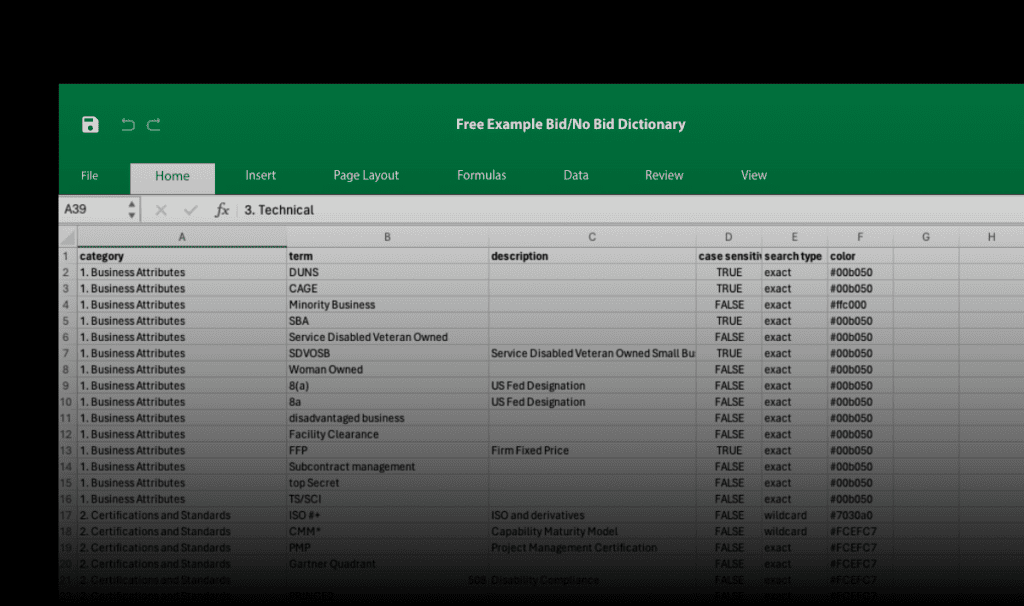
3. What content drives the Readability & Grade Level? – Paragraph based scoring
We have always provided good insight at the page level, but we wanted to take it right down to the paragraph level. So we extended the content view to easily identify scores for each paragraph. Within a given page certain paragraphs may distort the overall score in a positive direction, so this gives deeper insights.
In the ‘clear language’ tab simply select a page URL. In the below window, VisibleThread Web highlights areas that you may be able to improve.
To remind, blue highlights show long sentences, red highlights show passive voice. What’s new is that both the ‘Flesch Readability’ and the Grade score now surface at paragraph level. So you can easily see which paragraphs to focus on fixing.
Writers and editors can easily identify and optimize specific sentences to improve writing.
We also have introduced a dotted underline for words that contain more than 3 syllables like this:
Why?
Multi-syllabic words weight heavily on the readability score. So if you see copy like this: ‘Please make an application‘, consider the less complex ‘Please apply‘. Notice less syllables and easier to read. This will improve reader engagement and reduce cognitive burden. In our view above the word ‘application’ would have a dotted underline. Dotted words in the view above have potential to be simplified and improve readability scoring.