A readability analysis of the Canadian Government’s Top Tasks
Read on below or access the complete report in PDF format here.
Since 2013, the Canadian Government has adopted an approach to web design that focuses on the top tasks that web visitors need to complete on their online user journey. A top tasks strategy means you focus on what really matters (the top tasks). And focus less on the tiny tasks. This forces web designers and content creators to look at website design, user experience, and readability from the visitor’s perspective.
For governments and major brands, it makes content easier to find and simplifies the user journey. From a whole of government digital transformation perspective, there are 3 core benefits to a top tasks strategy:
- improves government-citizen engagement
- increases citizen/business compliance levels
- lowers costs (notably, call center costs)
Here’s how Canada.ca describes the objective:
“People come to our digital channels to accomplish a very wide range of tasks… people come to Canada.ca with a goal in mind and a task that they want to accomplish. If they are able to accomplish their task, their need has been met. If not, we have work to do.”
How do you identify top tasks?
There are two central factors to consider when applying a Top Tasks approach:
- How do you identify the top tasks?
- How do you ensure that each top task has an easy-to-understand user journey?
The Canadian Government identified the 100 top tasks by following this process:
- Collect data from various sources including; online visitor traffic, search logs, internal & external surveys, etc.
- Understand Task Boundaries between core tasks and sub-tasks. For example “Get a passport” involves sub-tasks; “checking eligibility”, “checking passport photo requirements” etc.
- Validate the task list with users. The government used surveys and direct discussions with users to refine the list.
You can find more detail on this process on the Canadian Government’s website. See their full list of 100 top tasks here.
To give a sense, here are the Canadian Government’s current top 5 tasks:
1) Get a local weather forecast
2) Get a visitor visa
3) Apply to immigrate to Canada
4) Get marine conditions
5) Get an eTA (electronic Travel Authorisation)
How do you ensure that each top task has an easy-to-understand user journey?
The Canadian Government believes that plain language and good readability is a critical success factor for completing Top Tasks. In fact, the use of plain language is a requirement of the Directive on the Management of Communications. For example, the Canada.ca style guide states:
- Use active voice over passive voice (section 2.3)
- Use short sentences and paragraphs (section 2.7)
- Check the reading level of your content (section 2.9)
- Avoid jargon, idioms, and expressions (section 2.5)
Both the Canadian Government and the Province of Ontario instruct that their content should be at grade level 8 or 7.
We wanted to find out how the various government agencies are performing against this plain language goal, so we analyzed task content. You can view the full report as a PDF or continue reading below.
Our Scoring Methodology
We chose 6 tasks spread across multiple government agencies. We measured high-ranking tasks and ones further down Canada’s list.
Here are the 6 Top Tasks we analyzed:
- Get a visitor visa (Canada Border Services Agency & Immigration, Refugees and Citizenship Canada)
- Apply to immigrate to Canada (Immigration, Refugees and Citizenship Canada)
- Get recalls and safety alerts (Health Canada; Transport Canada; Canadian Food Inspection Agency)
- Apply for Employment Insurance (Employment and Social Development Canada)
- Get info about diseases (Public Health Agency of Canada)
- File a GST/HST return (Canada Revenue Agency)
We included English and French-language content. After running the web pages through our analysis, we benchmarked clarity across these three dimensions:
Long Sentence Density
What proportion of all sentences are too long?
Passive Language Density
Can passive language be replaced with more clear active language?
Readability Score
How simple is the content to read?
Key Findings
Although our research revealed some encouraging results, there are clear areas where the Canadian Government can improve.
View the key findings including a table of results and graphs to illustrate results in PDF format here.
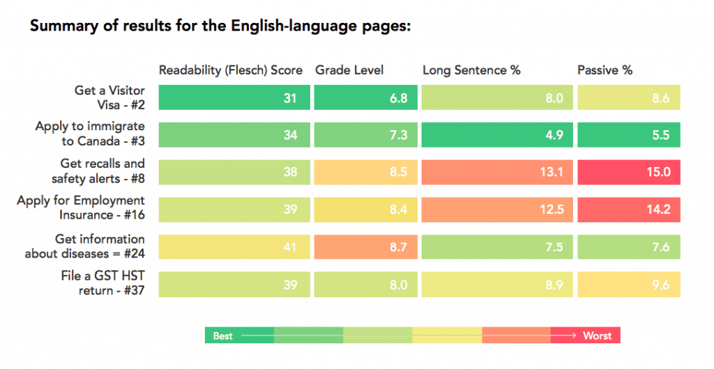
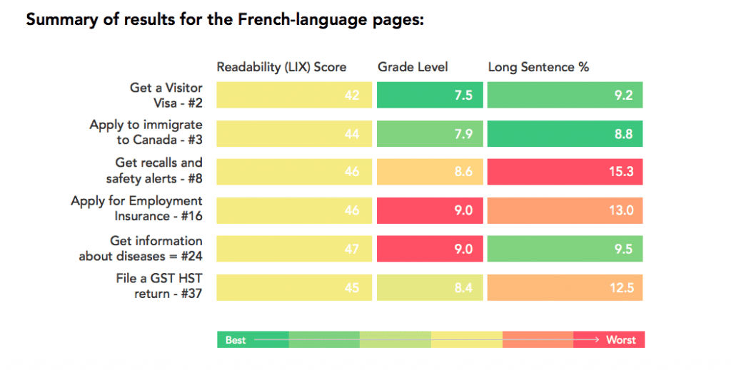
Content across pages is not always easy to understand.
Although there are some positive results indicated by patches of green across the charts, orange and red color-coding shows us where one or two specific scores indicate that users will find the content difficult to digest, therefore affecting the user journey. For example, the task associated with “Getting information about diseases” across the French-language pages is particularly challenging for users to understand. They are also pitched on average at 9th-grade, which is above the recommended level.
English content achieves recommended readability levels
Canada.ca recommends that you write content at an 8th-grade level or lower. It is good to see that, for the most part, the English-language pages are pitched at an average 8th-grade level.
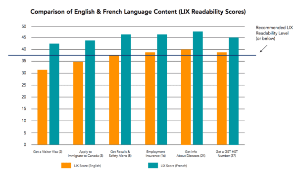
French-language content is generally harder to read than English content
Using the LIX Readability Formula, French-language content has a larger clarity gap without exception.
The higher the rank of the task, the more time and attention it receives. In theory, higher ranked task content should have better readability scores. This was generally true for five of the tasks we selected. However, the “File a GST HST return” task (ranked the lowest of our example tasks at #37) did not correlate with this theory as it performed better than some of the tasks ranked above it.
Readability levels generally align to Top Tasks rankings
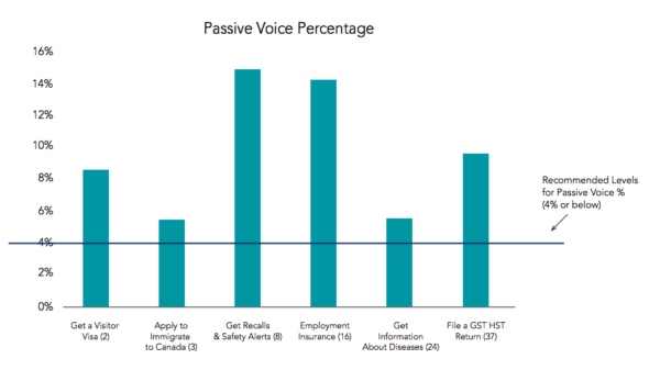
Passive voice levels in Canada’s content are high
As previously mentioned in this report, the Canada.ca style guide states that content should be written in the active voice because it communicates more clearly than passive voice. The active voice promotes simple, straightforward writing. As such, most scientific journals encourage the use of the active voice over the passive voice.
Unfortunately, the average level found in Canada’s content was 10%, so more than twice the recommended percentage of 4%. Only the citizenship-oriented content (the task “Apply to immigrate to Canada”) came close to meeting recommended levels at 5.5%.
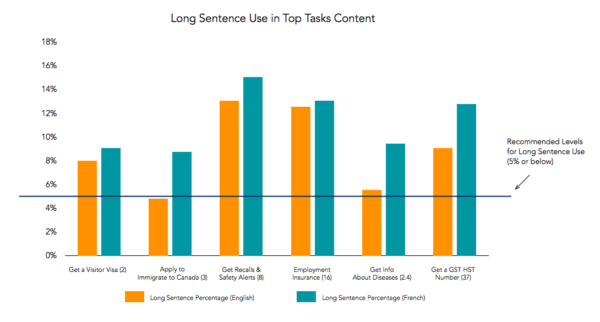
Sentences are unnecessarily wordy
Long, convoluted sentences make content harder to read. In general, we should aim for 5% long sentence use or less. Research shows that, in the vast majority of Canada’s content, long sentences are rampant.
In fact, only content related to the “Apply to immigrate to Canada” task (and only across English-language pages) met these recommended levels.
It is worth noting that, once again, Canada’s French-language content performs less favorably in this measure across the board.
Content readability varies greatly between agencies
Writing is a personal expression, even when writing professionally. Every individual has style preferences and in large organizations it can be difficult to merge content and make sure it is consistent. This is why we see a lack of coherence across our sample task pages.
Visualizing the User’s Path Across One Task
We have taken task 8 as an example of how the user journey moves across the subtask pages. Across the journey, there are different points at which individual pages are performing well or badly, showing that each page presents its own unique challenges to be tackled.
Conclusion
The Canadian Government believes that plain language and good readability are critical success factors for completing Top Tasks, as these are indicators to predict how well people will understand your content.
Our research shows a mixed picture, with some encouraging examples of where readability across task pages is clear, as well as opportunities for improvements. For example, task pages are often failing website users due to complex content, a high percentage of long sentences, or over-use of the passive voice. In some cases, a couple of low scores combine across the categories to give an overall poor score and low readability. This situation creates confused and frustrated users, and must be addressed.
Managing content across multiple agencies and individuals is challenging, and so the right tools must be used to make sure that users are given a consistent web experience. VisibleThread offers an efficient way to assess the readability of your content before it is published, leading to a more seamless and satisfying user experience. By applying VisibleThread’s solutions to each of the pages within Canada’s priority list of Top Tasks, the content within these pages will be consistently clear and coherent.